by Erin Robert
Altruist x Collins: rebrand
Altruist // An online financial advisor platform
Collins // Design & branding agency
My role: Creative Director
In 2023, Altruist decided to rebrand the company to reposition themselves as a modern, competitive, and forward-thinking player in fintech. The existing brand felt outdated and tied to traditional financial advisory norms. I was brought in as the Head of Brand & Design to brief and worked directly with the Collins team to create a new identity that reflects the innovation and disruptive approach of Altruist’s online platform. The brand was launched in March 2024, took about a year, and had a $1M budget.

Logo

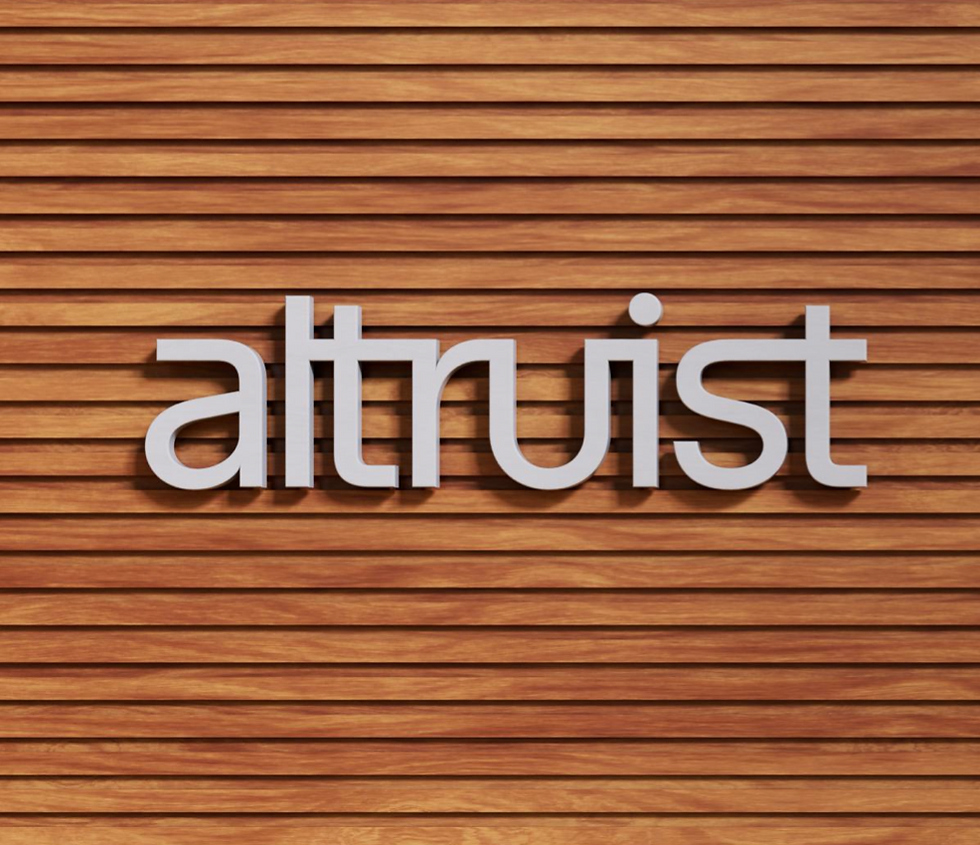

01
Before & After
We began with the logo because it would set the foundation for the rest of the brand system. The main challenge was deciding whether to include a logomark, but Collin's explorations showed that additional marks felt distracting. Since the wordmark was already bold and confident on its own, and worked on both large and small scale assets I helped direct the decision around using it as the primary logo.
Its design also reinforces our brand purpose, with ligatures symbolizing the advisor–client relationship and the tall x-height representing progress toward shared financial goals.
Color


02
Accessiblity at the core
When we started the discovery phase of the color rebrand, it was crucial to focus on accessibility this time around, as the previous colors were muted and did not pass accessibility standards across both web and product.
The base of the new color palette was grounded in white and black. The supporting colors give us impact and vibrancy, and offered gradient tones in order to play with depth.
Typography


03
Type as a design element
The brand is defined by two key typefaces—Waldenburg and Oceanic Text—selected for both their style and their strong product legibility. Waldenburg, the primary typeface and the foundation of the wordmark, appears in all communications and offers multiple weights that allow typography to function as a graphic element. Oceanic Text, the secondary typeface, provides an upright contrast with its serif details, adding character and lasting appeal.
Product


04
Brand in product
Product was also a part of the rebrand, but it was scoped for phase 2. However, we did keep it in mind as we were exploring how it would show up in marketing. We took an abstracted UI approach to help get us through interim until the product was redesigned. The gradient layers helped bring in our colors while adding depth to a very minimalist product design.
Brand Reveal


05
Company Retreat Swag
The first execution of the brand was used on employee swag for the 2025 Company Retreat where the brand would be revealed.
As a lot of assets were still in production it was an instance to play with type, lines, and inks.